
You’re sitting in a Monday morning pipeline review, scrolling through a spreadsheet someone emailed Friday afternoon. Three reps haven’t logged visits in a week. One territory shows zero pipeline movement, but you can’t tell if it’s a data problem or a performance problem. By the time you figure it out, Tuesday is half over — and you’ve spent your coaching window staring at stale numbers.
This is what happens when field sales managers rely on static reports instead of real-time dashboards. According to SPOTIO’s 2026 State of Field Sales survey, field reps spend just 43% of their time actually selling — and 21% disappears into admin work and manual data entry. A well-built reporting dashboard doesn’t just display data. It tells you where to look, what’s off, and what to do next, before the week gets away from you.
Below are five field sales dashboard setups — territory maps, pipeline views, leaderboards, revenue tracking, and mobile views — with the metrics that belong on each one and how to build them.
What Is a Sales Reporting Dashboard?
A sales reporting dashboard is a real-time visual interface that pulls field sales data — activities, pipeline, revenue, territory performance — into one screen, organized by the metrics that matter to whoever is looking at it.
How Dashboards Differ From Sales Reports
A sales report is a point-in-time document: here’s what happened last week, or last month. A dashboard is a live monitoring tool: here’s what’s happening right now. Reports answer “what did we do?” Dashboards answer “what should we do next?” For a full breakdown of the report types field teams need and when to run each one, see our guide to sales reports for field sales teams.
Why Field Sales Dashboards Are Different
Generic CRM dashboards are built for inside sales teams sitting at desks. Field teams need something else entirely:
- Location-verified activity data — not self-reported call logs, but visits with GPS coordinates attached to every logged activity
- Territory map views — color-coded geographic performance, not just a flat table of account names
- Mobile-first design — your reps check dashboards from a truck between appointments, not from a second monitor
- Offline access — SPOTIO’s Download My Day feature lets reps pre-download their territory so field coverage doesn’t stop when cell signal does
That 21% admin tax from the SOFS survey? Most of it comes from reps manually entering data at end of day that one-tap field logging and real-time CRM sync eliminate. Fix the input, and the dashboard takes care of itself.
5 Sales Reporting Dashboard Examples for Field Teams
Every dashboard below solves a specific management problem. The views shown are from SPOTIO’s My Reports and territory mapping tools, but the structure applies regardless of your platform.
1. Territory Performance Dashboard
The management problem it solves: You need to know which territories are producing — and which ones are going dark — without waiting for month-end numbers.
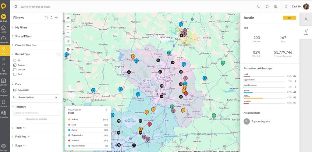
What’s on it:
- Revenue by geographic territory (current period vs. prior period)
- Activity density: visits, calls, and proposals per zone
- Coverage gaps: territories with declining activity or zero pipeline
Who checks it: VPs and directors making territory rebalancing decisions. When the Southwest is running 40% ahead and the Northeast has gone quiet, this dashboard shows it in real time — not in next month’s business review.
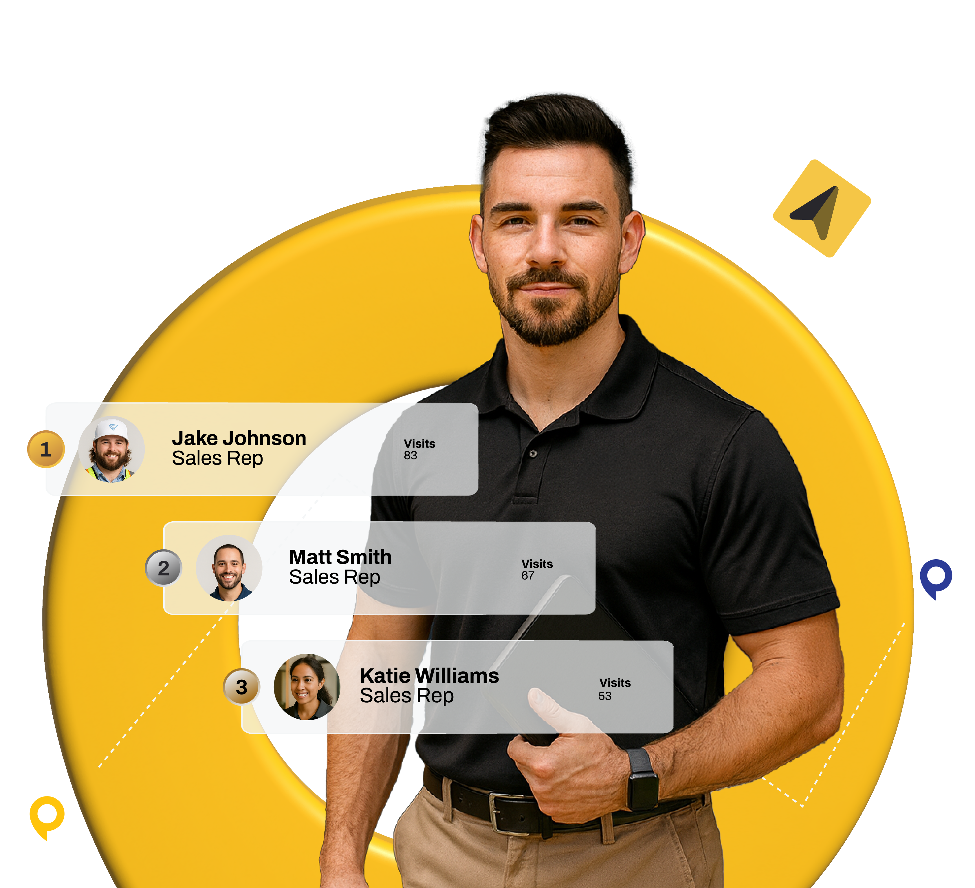
2. Rep Activity & Leaderboard Dashboard
The management problem it solves: You can’t coach what you can’t see. This dashboard shows daily and weekly effort across the team so you can spot who needs help before they fall behind.
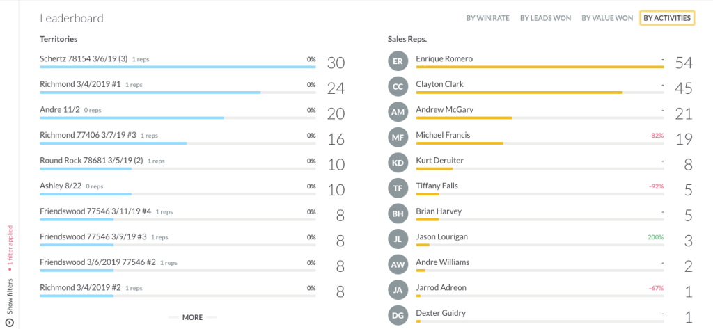
What’s on it:
- Visits logged, calls made, emails sent — ranked across the team
- Leaderboard with selectable metrics (you choose what to rank by)
- Activity trends: is a rep’s volume holding steady or dropping off?
Who checks it: Front-line managers running daily or weekly coaching. If a rep’s visit count drops by half on Wednesday, you see it Wednesday — not in Friday’s report. SPOTIO’s leaderboard makes this visible to the whole team, which tends to create healthy competition without managers having to force it.
3. Pipeline Health Dashboard
The management problem it solves: Deals stall silently. This view surfaces stuck deals, coverage gaps, and stage-by-stage progression before a forecast miss becomes inevitable.
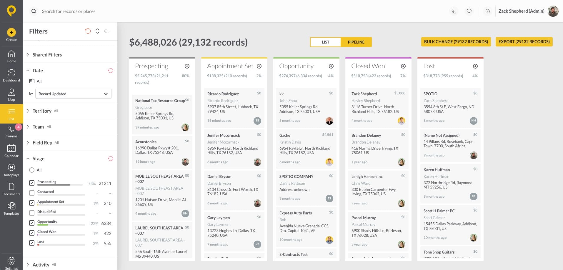
What’s on it:
- Deals by stage with dollar values
- Deals that haven’t moved stages in X days (your stuck-deal threshold)
- Pipeline coverage ratio: total pipeline ÷ quota target
Who checks it: Managers and reps during weekly pipeline reviews. The pipeline coverage ratio is the single metric most managers underuse — for the formula, benchmarks, and how to coach from it, see our guide to field sales performance analytics.
4. Revenue Dashboard
The management problem it solves: Executives need a clean read on closed business — by rep, by territory, by time period — without pulling separate reports from three systems.
What’s on it:
- Closed revenue by rep, by territory, by week/month/quarter
- Quota attainment: actual vs. target, with trend lines
- New business vs. repeat business split
Who checks it: VPs and directors for monthly and quarterly business reviews. This is the view that answers “are we going to hit the number?” — and if not, where’s the gap.
Customer proof: Advocate Construction used SPOTIO’s analytics dashboards to track rep and territory performance and saw a 300% increase in year-over-year wins, with a 263% increase per rep. The dashboard didn’t close those deals — but it showed managers exactly where to focus coaching and territory support.
5. Mobile Field Dashboard
The management problem it solves: Your reps are in the field, not at a desk. They need to check their own pipeline, today’s route, and daily progress from their phone — without logging into a laptop.
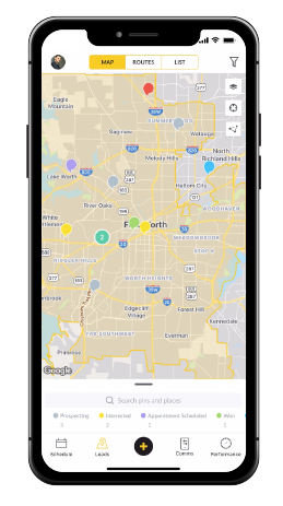
What’s on it:
- Today’s route and scheduled visits
- Personal pipeline: deals by stage, next actions
- Activity count: visits completed vs. daily target
Who checks it: Field reps between appointments. A rep finishes a site visit, glances at the app, sees two proposals sitting in the “sent” stage with no follow-up, and makes the calls from the parking lot. That’s the difference between a dashboard that gets used and one that gets ignored.
What Metrics Belong on a Reporting Dashboard?
Less than you think. The instinct is to load every KPI onto one screen, but a dashboard with 20 widgets is a dashboard nobody reads. Organize by tier:
| Tier | Purpose | Example Metrics | Which Dashboard |
|---|---|---|---|
| Activity | Are reps doing the work? | Visits/day, calls made, emails sent | Leaderboard, Mobile |
| Pipeline | Is the work creating opportunities? | Deals by stage, pipeline coverage, stuck deals | Pipeline Health |
| Revenue | Are opportunities turning into money? | Closed revenue, quota attainment, win rate | Revenue, Territory |
Start with one metric per tier. Add more only when your team is consistently acting on the first three. For full KPI formulas, benchmarks, and the analytics-to-coaching workflow, see our guide to field sales performance analytics.
For the daily → weekly → monthly reporting cadence that structures when to review each tier, see our sales activity reporting guide.
Want to see how these dashboards look with real field data? Explore SPOTIO’s dashboard and reporting tools — or keep reading to build yours step by step.
How to Build a Sales Reporting Dashboard
Step 1: Start With the Decision, Not the Data
Before you add a single widget, answer this: what action will this dashboard trigger? If a metric doesn’t change a decision you make this week, it doesn’t belong on the dashboard. “Total emails sent” is a vanity metric unless you’re specifically coaching email outreach volume. “Pipeline coverage ratio by territory” triggers a resource allocation decision. Keep the ones that drive action.
Step 2: Match Views to Roles
Not everyone needs to see everything. Build role-specific views:
| Role | Primary View | Metrics | Refresh |
|---|---|---|---|
| Field Rep | Mobile dashboard | Personal visits, pipeline, daily target | Real-time |
| Manager | Leaderboard + Pipeline | Team activity, stuck deals, coverage ratio | Daily |
| VP/Director | Territory + Revenue | Revenue by territory, quota attainment, forecast | Weekly |
Step 3: Connect Your Data Sources
Dashboard accuracy depends on data quality. In field sales, that means:
- Real-time, bidirectional CRM sync — updates flow both ways without manual re-entry
- Location-verified activity capture — reps log visits with one tap, and GPS coordinates are attached to every activity
- One-tap logging — notes and outcomes entered in the field, not reconstructed at a desk at 6 PM
- Multiple capture methods — beyond one-tap logging, DASH supports voice-to-CRM (dictate visit notes hands-free), Visual Data Capture (photograph documents or job sites to extract structured data), and text-based logging for quick updates between stops
When data syncs in real time and reps log activities with one tap instead of reconstructing them from memory, the dashboard stays honest. When reps are manually entering visits from memory at the end of the day, your dashboard is showing you fiction.
Step 4: Build It in SPOTIO’s My Reports
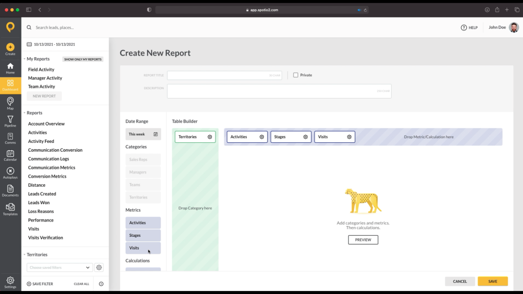
SPOTIO’s My Reports tool lets managers build custom dashboards in minutes. Select your metrics, filter by territory or rep, set the date range, and save the view. You can schedule reports to auto-deliver, share saved views with your team, and run everything from desktop or mobile.
The drag-and-drop builder means you don’t need a RevOps team or a BI tool to get a dashboard that actually matches how your team works.
Step 5: Test With Three Metrics, Then Expand
Don’t roll out a 15-widget dashboard on day one. Start with three metrics: we recommend visits per day, pipeline coverage ratio, and quota attainment — and run with those for two weeks. If your managers are acting on all three consistently, add the next tier. If widgets are sitting there unread, remove them before adding more.
Using AI With Your Sales Dashboard
Ask Questions Instead of Building Views
SPOTIO’s DASH AI lets managers ask plain-language questions and get dashboard-ready answers without building a custom report. Instead of clicking through filters, you ask:
- “Which territories had declining visit volume this month?”
- “Show pipeline coverage for every rep on the Southeast team.”
- “What’s my team’s average deal size this quarter compared to last?”
DASH surfaces the answer from your existing data. When action is needed — updating a record, logging an activity, scheduling a follow-up — DASH shows a confirmation preview before any change is written. The rep or manager approves every step.
Beyond querying dashboards, DASH also streamlines how data gets into the system in the first place. Reps can log activities by voice, photograph a document to capture structured data, or type a quick text update, all of which feed the same real-time dashboards.
For details on how AI integrates with field sales data capture, including voice-to-CRM, see the AI section of our sales reports guide.
Frequently Asked Questions
A sales reporting dashboard is a real-time visual interface that aggregates field sales data: activities, pipeline, revenue, and territory performance — into customizable views. Unlike static reports that show what happened last week, dashboards show what’s happening now, so managers can coach and reps can act before opportunities slip.
A report is a point-in-time document: a snapshot of performance over a specific period. A dashboard is a live monitoring tool that updates continuously. Reports tell you what happened; dashboards tell you what to do next. Most field teams need both: dashboards for daily management, reports for weekly and monthly reviews.
Start with three tiers: activity (visits per day, calls made), pipeline (deals by stage, pipeline coverage ratio), and revenue (closed revenue, quota attainment). Resist the urge to add 20 metric: a dashboard nobody reads is worse than no dashboard at all. Add metrics only when your team acts on the ones already there.
Activity and pipeline dashboards should refresh in real time or near-real time, because field conditions change by the hour. Revenue dashboards can refresh daily or weekly, since closed business moves more slowly. The key is that the data feeding the dashboard must flow from one-tap field logging and real-time CRM sync, not manual entry at end of day.
Yes. With access to your CRM data, AI can assemble dashboard views, select relevant metrics, and surface insights without manual report-building. You can ask plain-language questions like “show me pipeline coverage by territory” and get dashboard-ready answers instantly. The practical limit is data quality: AI can only visualize what your team actually logs, so real-time field capture matters as much as the tool you use to display it.
Ready to see what these dashboards look like with your team’s data? Request a personalized demo.

Scott Shapiro is President of SPOTIO and a seasoned sales and revenue leader with more than two decades of experience scaling high-performance sales organizations. Before joining SPOTIO as Chief Revenue Officer, he held CRO roles at PowerDMS and Igloo Software, and spent nearly 11 years at Paycor progressing from Area Sales VP to VP of Sales. A 9-time President's Club qualifier — recognized as the top sales executive or leader in his organization 6 of those years — Scott brings deep expertise in sales management, revenue operations, and go-to-market strategy. He holds an MBA from the University of Notre Dame and a B.S. from the University of Cincinnati.